General Tab
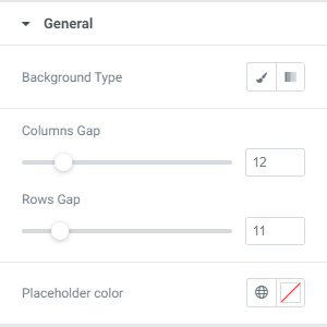
From the General tab you can change the form’s background, columns and rows gaps, as well as the input placeholder color.
Label Designs
From the Label panel you can customize the label text colors, the *require mark color, typography and margins.
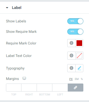
If you want to delete labels from your form, just turn off the Show Labels switcher.
If you want to show *require marks, turn on the Show Require Mark switcher.
When you set the *require marks to “show”, you can easily change the color of the markers using the Require Mark Color selector.
From Label Text Color choose the color that you prefer.
From the Typography menu you can change the label’s font-family, font-weight, font-size, etc.
From the margins settings you can easily set margins for the labels.
Fields Design
From the fields panel you can change the input’s typography, text and background colors, set borders, outputs, margins, padding and border radius.
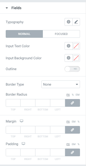
Fields have two states: Normal and Focused.
In each state you can change the input text colors, background colors and set outlines.
Button Design
From Button design panel you can change button typography, alignment, background and text colors, set borders, margins, padding and shadows.
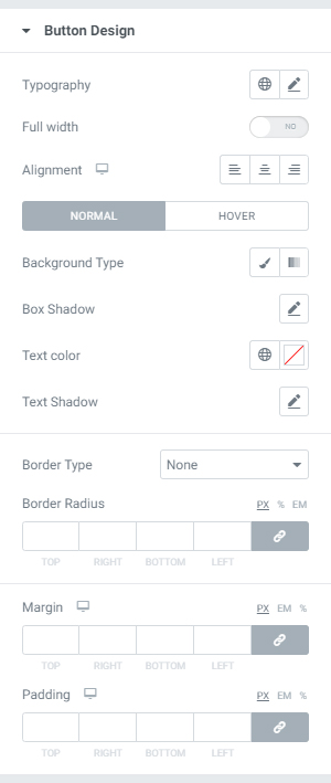
Buttons has two states: Normal and Hover.
In each state you can change the button background, shadow, text colors and text shadow.
Errors
From the Errors tab you can control the error messages of your form. You can change the error message color, position, typography, margins and padding.
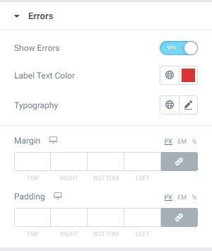
If you turn the Show Errors switcher to “Yes”, you will see the error messages presented in your Elementor View, allowing you to visualize and control their styling, positions, etc.
Message Box
From the message box tab you can change the message box colors, backgrounds, borders, typography, set alignment for text, border radius, margins and padding.
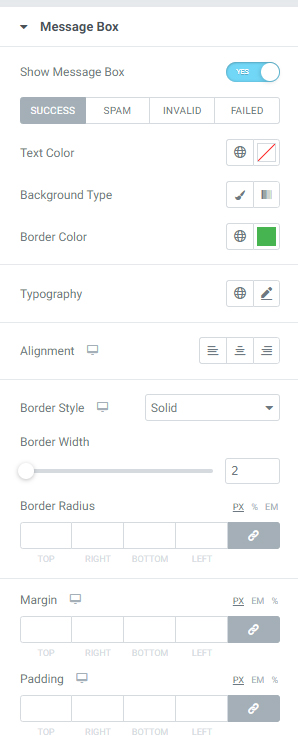
The Contact Form 7 has 4 types of message boxes: success, spam, invalid and failed.
For each type of message you can set different background, text and border colors.
For Steps design, follow this link.