Step Fields Type
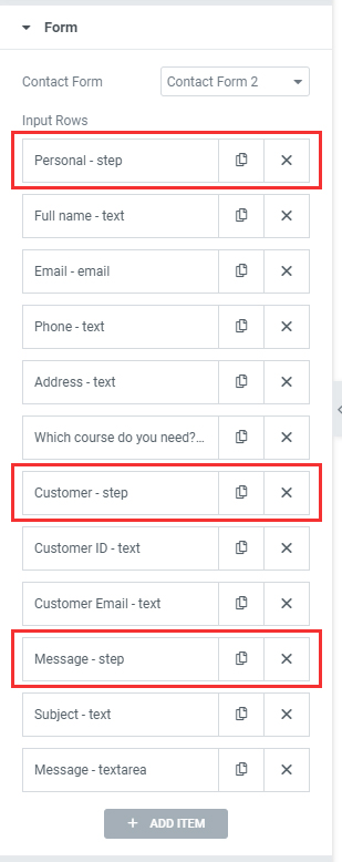
With Multi-Step Forms, you can create forms that have 2 or more steps. It allows users to fill out several fields by clicking Next and going step by step through the process.
Step types are special fields, that allow you to organize your fields into different groups.
In each step tab you will see two options:
- Label
- Icon
Step Settings
In the Step tabs to the left you will see style settings, that have several options:
- Number
- Icon
- Label
- Icon & Label
- Number & Label
Transitions: From the transition settings, choose the kind of animation you want for the contact form steps.
Step Design
The Step Design option from the Style tab will show the following settings.
- Typography: Change the typography of Steps numbers and labels.
- Spacing: Set the amount of space between the Steps and the form fields
- Separator Settings
- Show Separator: Switcher to hide or show separator lines.
- Separator Spacing: Set the amount of space between separators and points or labels
- Indicator Settings
- Point Size: Set the size of the points. (width and height)
- Indicator Design: Type of Step points. You can choose between Fill and Point types.
- Indicator Positions: If you set Point on Indicator Design, you can change Indicator Positions.
- Label Positions: Set Label position. (Bottom, Right).
- Indicator Label Spacing: Set the amount of space between the Point and Label. ( Right Position )
- Indicator Label Margin: Set the margin between the Point and Label ( Bottom Position )
- Indicator Padding: Set the padding around the Step section.
- Border Radius: Set the border radius of Points.
Inactive | Current | Complete
- Text Color: Set the color of Point Numbers or Icons.
- Label Color: Set the color of Labels.
- Border: Set the border of Point.
- Background Color: Set background color of Points.